clemsonjeep
Well-Known Member
I dropped off the files for the shirts last Friday and the person I worked with had a completely different view of how the black would look on the Cardinal colored shirt. The person I had been working with assured me that the black would look great and would have enough contrast to be easily read. In any case the new person showed me a shirt with black ink on it and said without having a 2nd color to add contrast that the smaller text would tend to blend together. I just didn't want white text...
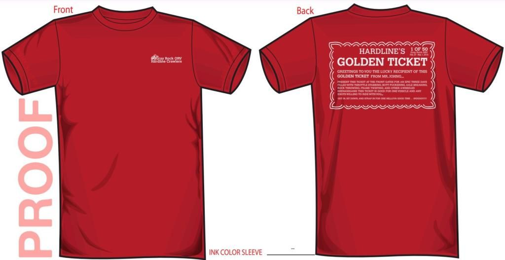
So...he said he'd work up a proof with the Cardinal shirt using a light gray ink for the design and send it over to see what I thought. I just received it and I really do think it looks good, but wanted to run it by everyone before giving them the go ahead since I had advertised them with black ink. Of course we can still do black too...

So...he said he'd work up a proof with the Cardinal shirt using a light gray ink for the design and send it over to see what I thought. I just received it and I really do think it looks good, but wanted to run it by everyone before giving them the go ahead since I had advertised them with black ink. Of course we can still do black too...


